- 0.1 Accessibility Resources
- 0.2 Who does what
- 0.3 Checklist
- 0.4 Screen readers we support and how to use them
- 1.0 Buttons and toggles
- 1.0 Bypass blocks
- 1.0 Focus Indicators
- 1.0 Images and Decorative Elements
- 1.0 Landmark structure- structuring elements correctly for screen readers
- 1.0 Modals
- 1.0 Tables
- 1.0 Tabs
- 1.0 Test Evidence Spreadsheet
- 1.0 Tooltips
- 1.1 Perceivable - Text alternatives
- 1.2 Perceivable - Time-based media
- 1.3 Perceivable - Adaptable
- 1.4 Perceivable - Distinguishable
- 2.1 Operable - Keyboard accessible
- 2.2 Operable - Enough time
- 2.3 Operable - Seizures and Physical Reactions
- 2.4 Operable - Navigable
- 2.5 Operable - Input Modalities
- 3.1 Understandable - Readable
- 3.2 Understandable - Predictable
- 3.3 Understandable - Input Assistance
- 4.1 Robust - Compatible
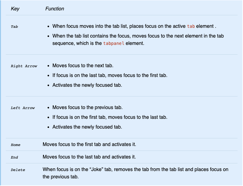
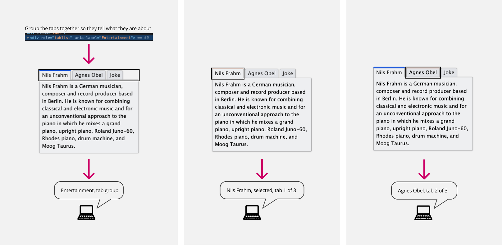
Tabs
Use tabs to switch between different views within the same context, rather than navigating to separate areas. This is crucial, as the primary purpose of tabs is to allow for easy view alternation without losing your place. Ensure that tabs function by using any element that is recognized as such.
For interactions and more screen reader coverage please look and test the url below:
https://www.w3.org/TR/wai-aria-practices/examples/tabs/tabs-1/tabs.html
Keyboard support